Stockwise
Branding / User Experience / Visual Design
Branding
User Interface
User Testing
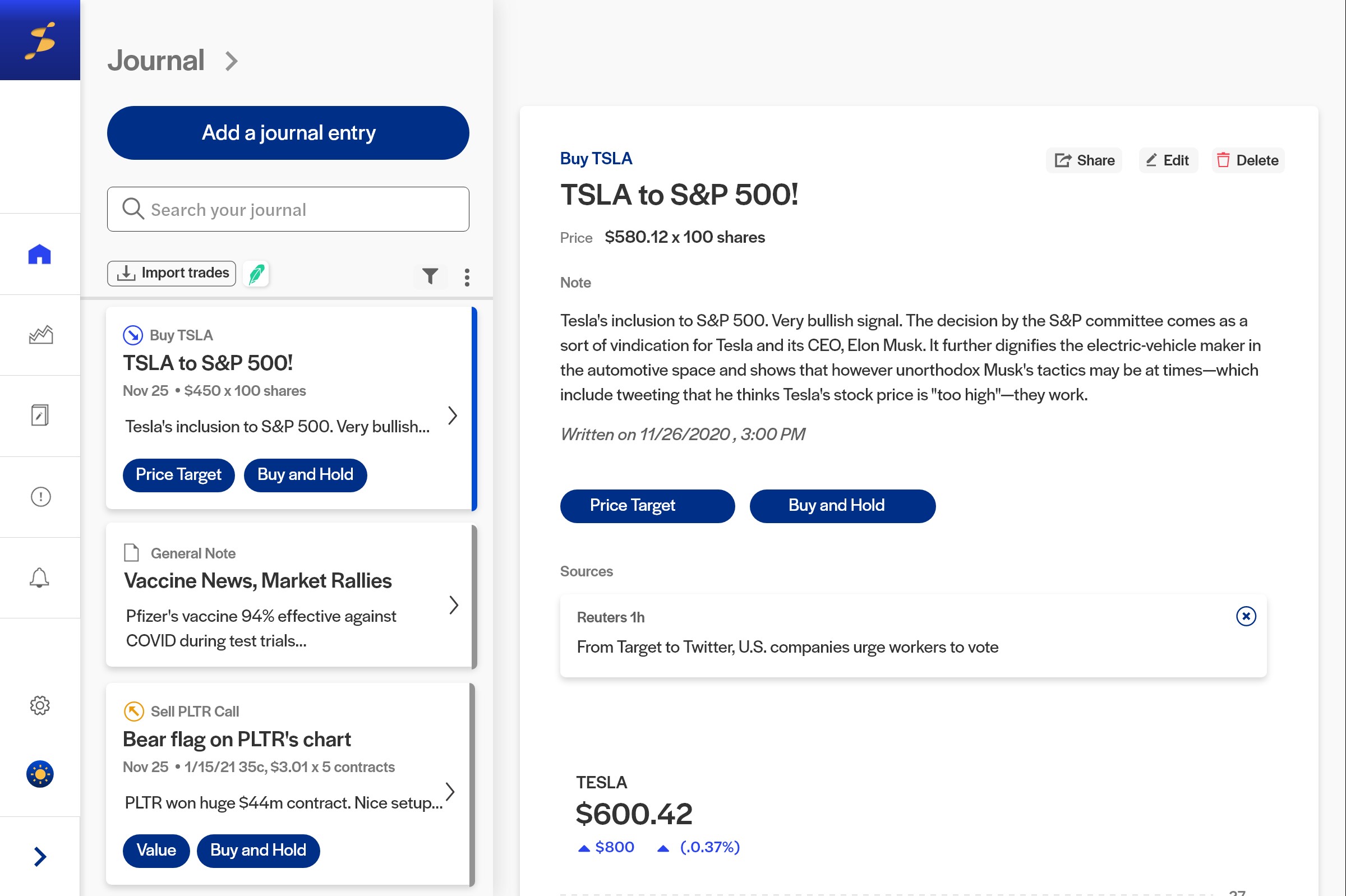
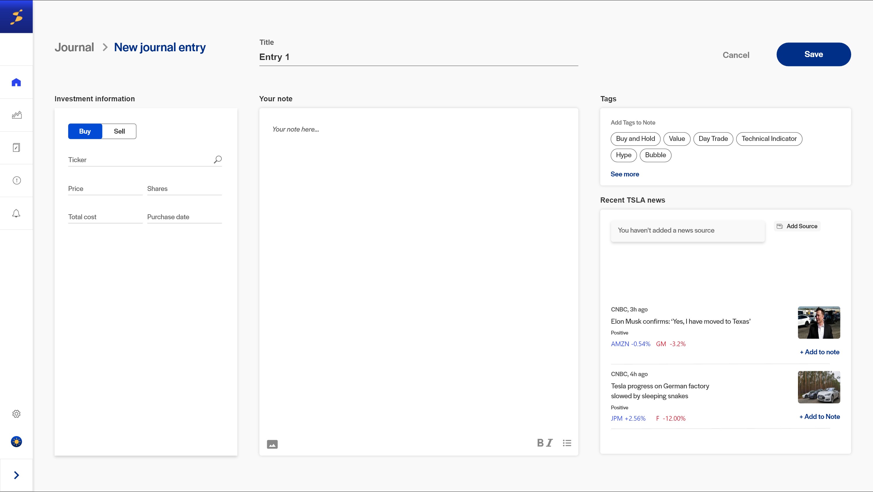
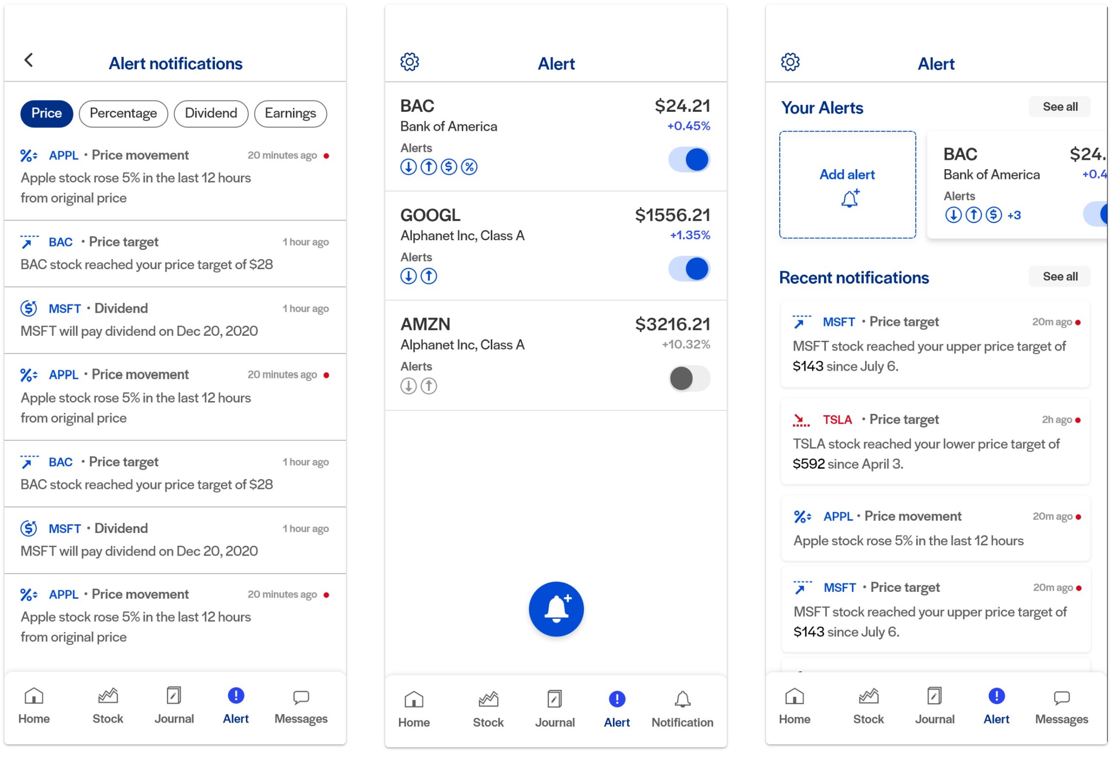
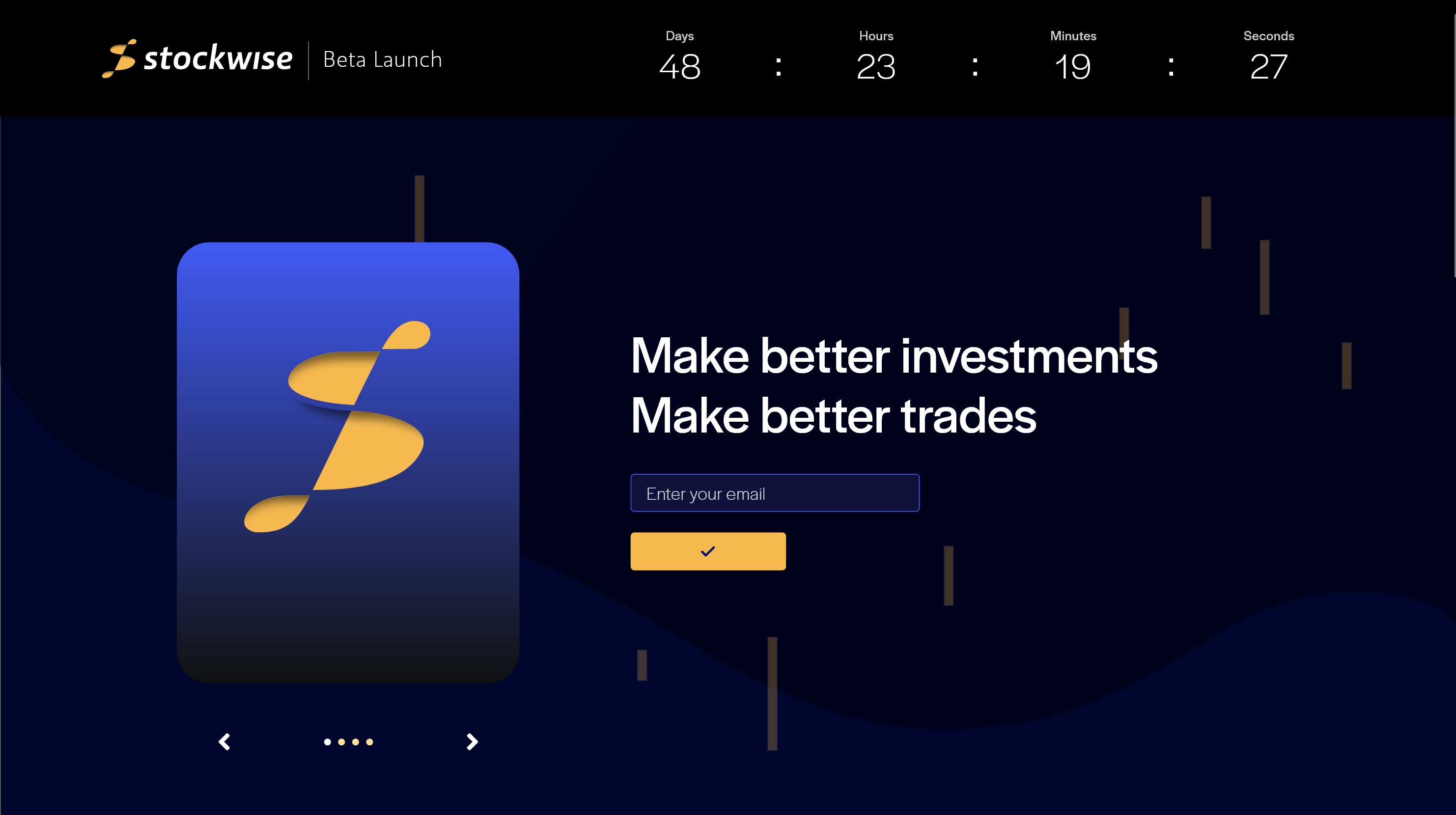
In the United States, 2020 was the year that saw many young investors flocking to the market after news of Covid-19 crossing the US border caused the stock market to crash to unprecedented levels. Even with a long time horizon, this new generation of investors often lacks the experience and knowledge necessary to make investing decisions that are based on fundamentals and not emotions. Stockwise is the answer to that problem. Equipped with a journal function and the ability to link to any brokerage, Stockwise's users can record their trade ideas, take notes about past invesment and keep track of open trades. They can also set alerts for their favorite stocks based on price movement, earning dates, or technical indicators which can help them make informed decisions and be a better investors.
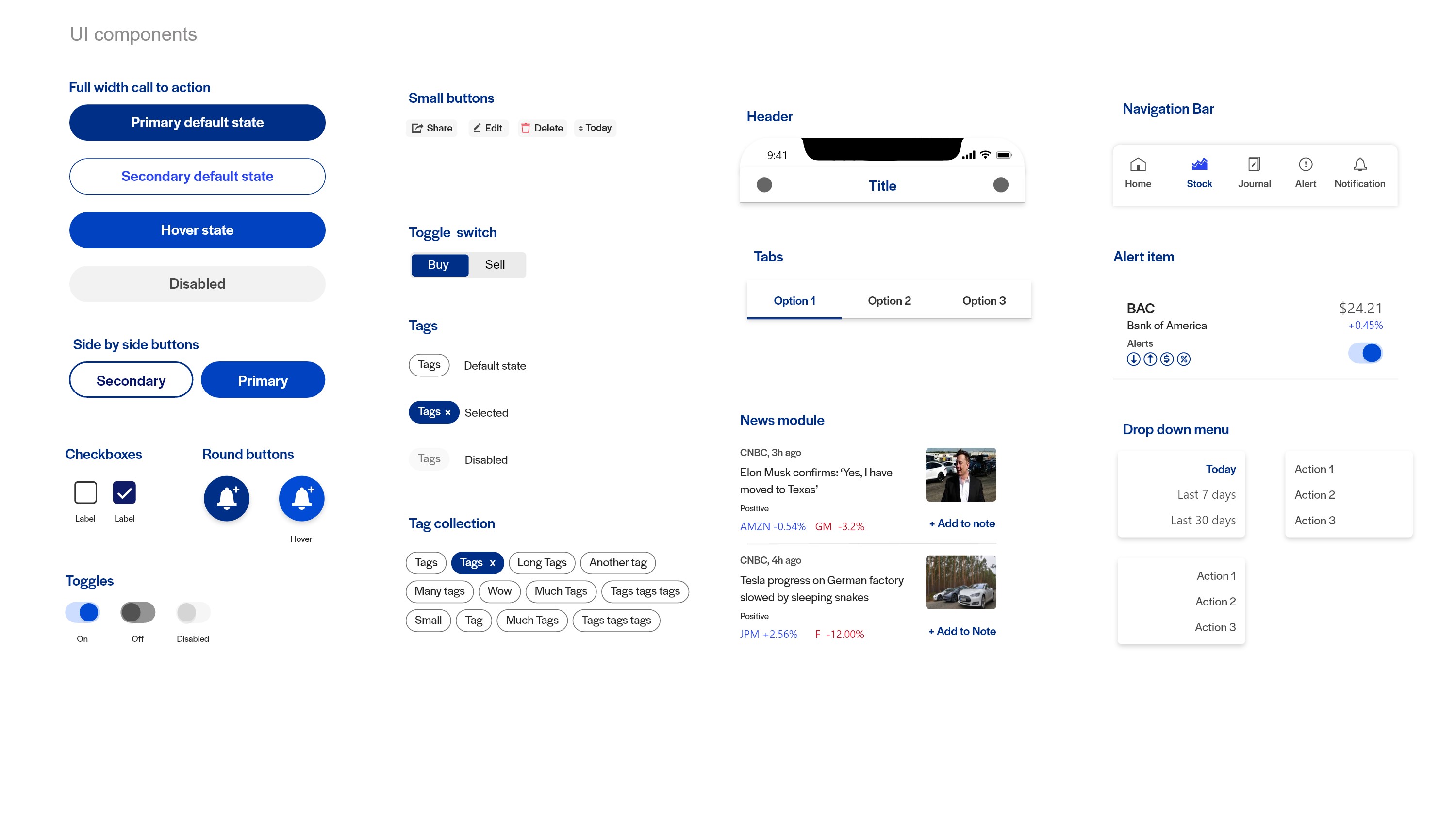
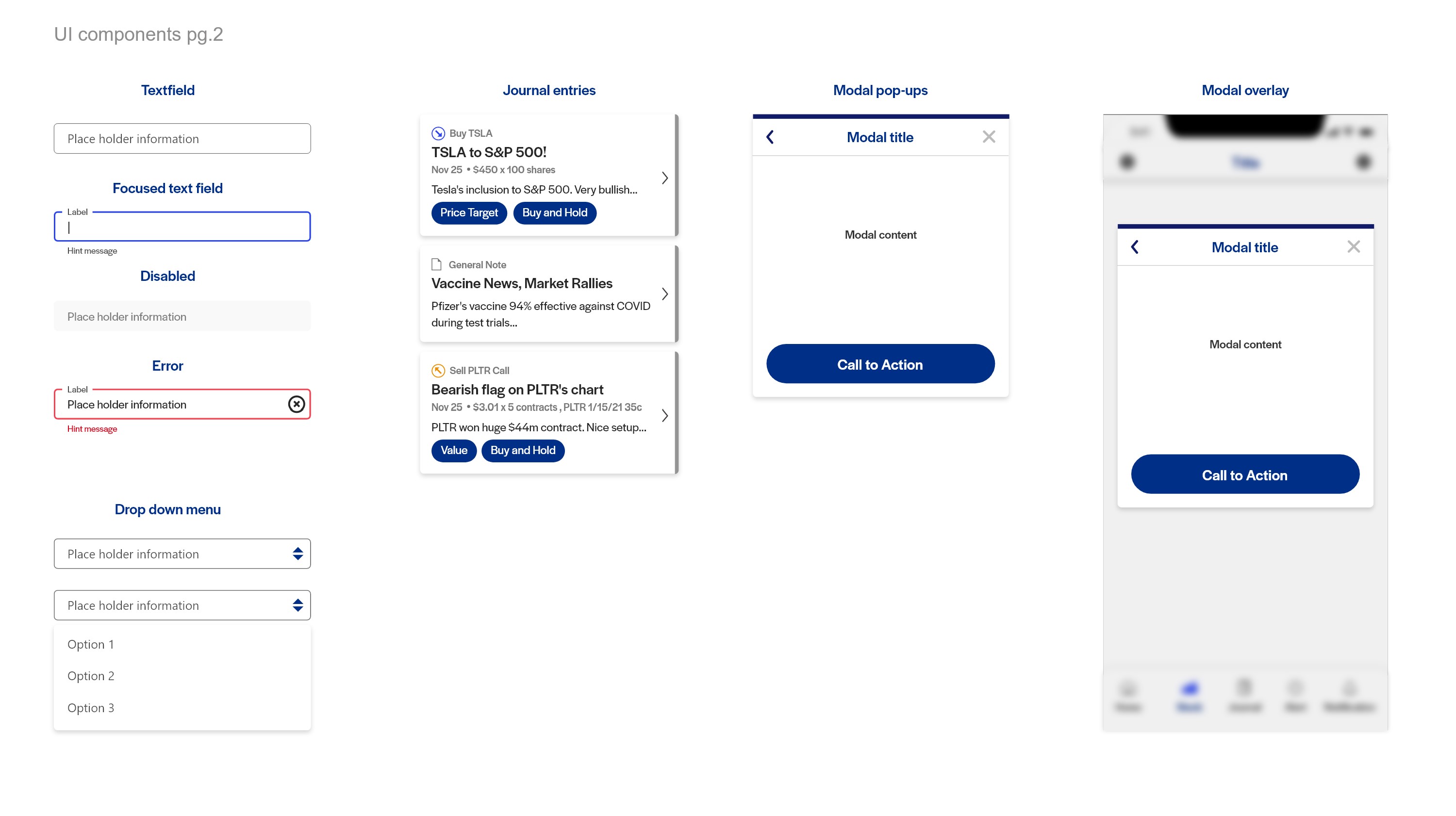
I was tasked with creating the brand identity for the soon to be released trading journal platform and its mobile and desktop interface. The final product is the end result of my collaboration with a team of designers, developers and business leaders. The interface was designed with accessbility and modularity in mind and will always work regardless of devices and screen sizes.
Icon set
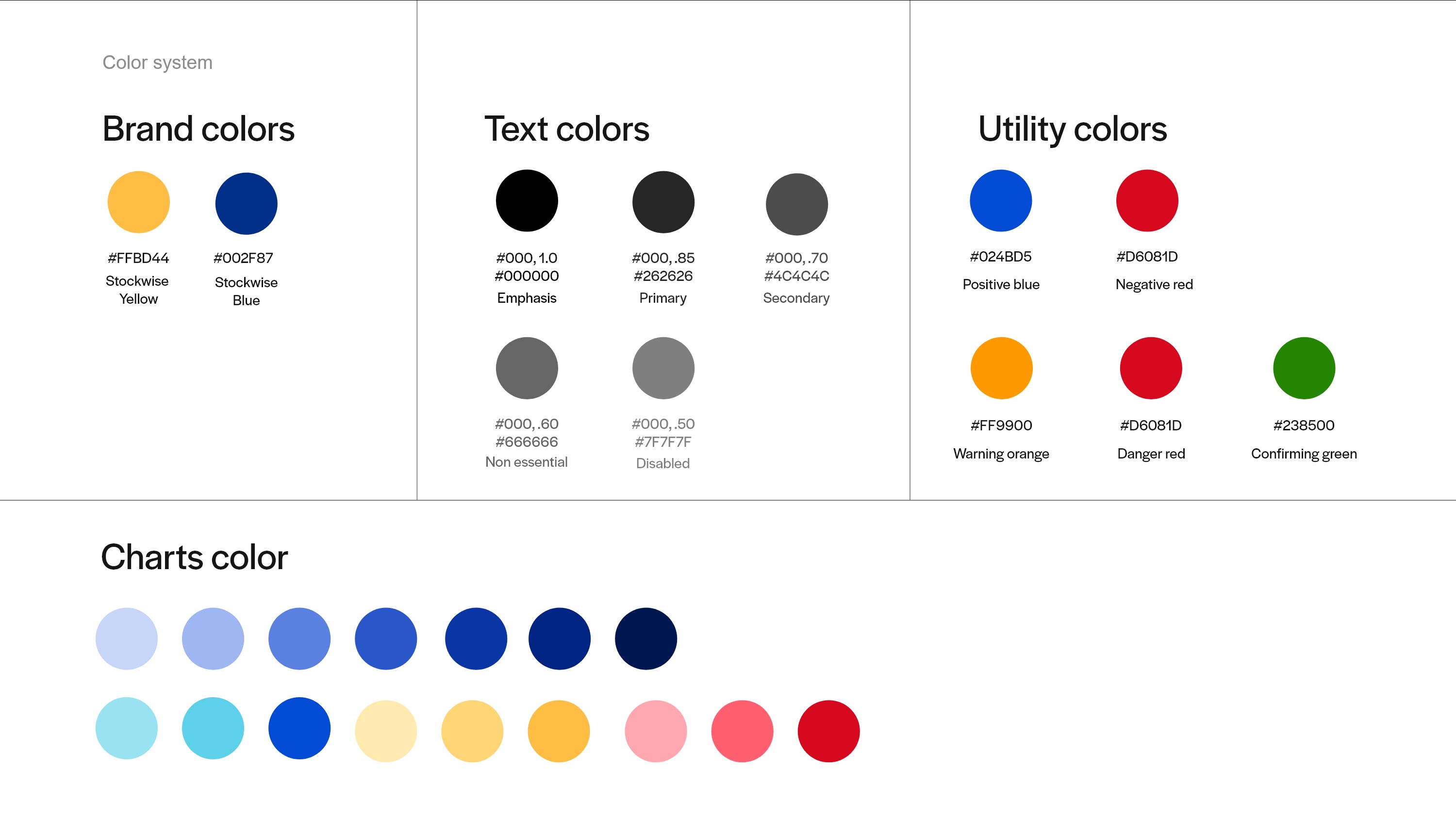
Color
UI Components
